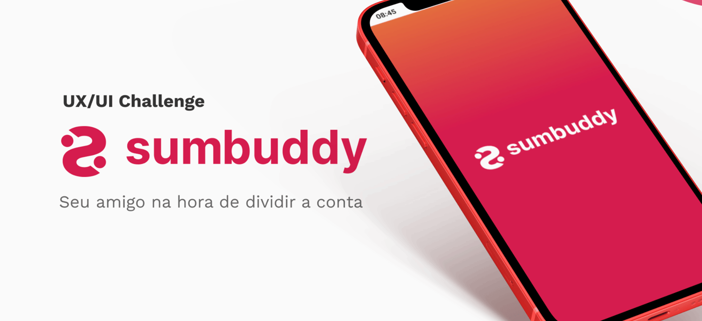
SUMBUDDY
MY ROLE
Ux Reseacher
User Flows
Wireframes
TIMELINE
4 weeks
SERVICES
UX Research, Criação de Persona, Mapa de Empatia, Wireframe, UI Design, Design System
SPLITTING THE BILL WITHOUT SPLITTING THE FRIENDSHIP: THE CHALLENGE THAT INSPIRED SUMBUDDY
Picture this: you’re out at a restaurant with friends. Everyone’s having a great time — until the bill arrives. Then comes the awkward silence. Who paid for what? Who still hasn’t transferred their part? How do you handle it without sounding pushy or disrupting the group vibe?
That’s where our challenge began. We had just 30 days to create a digital solution that made splitting expenses between friends simple, fair, and frictionless. But it wasn’t just about numbers and notifications — it was about easing communication, avoiding awkward moments, and protecting what matters most in any social setting: trust.
In a world where social connections often mix with shared responsibilities, Sumbuddy was born — an app designed to turn uncomfortable situations into smooth, collaborative solutions. Our mission was clear: deeply understand how people currently split bills, the pain points they face in that process, and how technology could support not just the task, but the friendship behind it.
LISTEN BEFORE YOU BUILD: DIVING INTO THE USER'S WORLD
Before thinking about colors, flows, or screens, we knew we had to understand the real context behind the seemingly simple act of splitting a bill. Our starting point was active listening — but with structure.
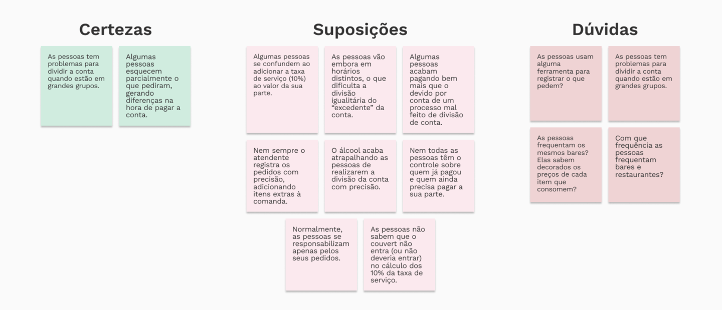
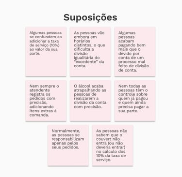
We kicked things off with the CSD Matrix (Certainties, Suppositions, and Doubts), a tool that helped us organize what we thought we knew about the problem. For example, we were certain that splitting bills often causes discomfort among friends, but we weren’t sure how people chose the tools to handle that. This exercise helped us frame our research with more focus and intention.
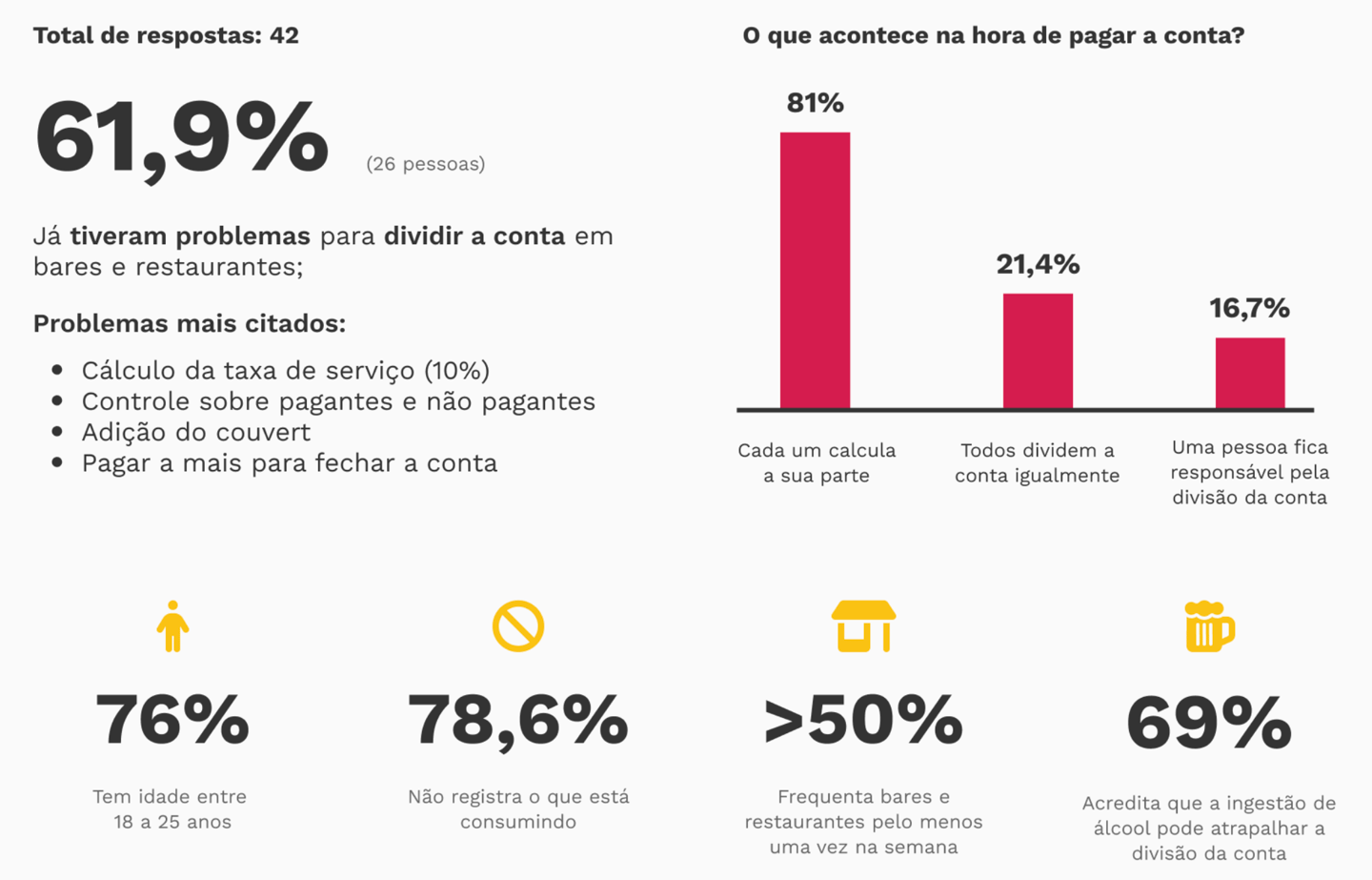
With the CSD matrix mapped out, we moved on to a quantitative survey, shared online, which gathered over 40 responses. The goal was to understand people’s behaviors, habits, and struggles when it comes to splitting expenses.
The data revealed some key insights:
These numbers shed light on the emotional side of the problem — it wasn’t really about the money, but about communication and discomfort.
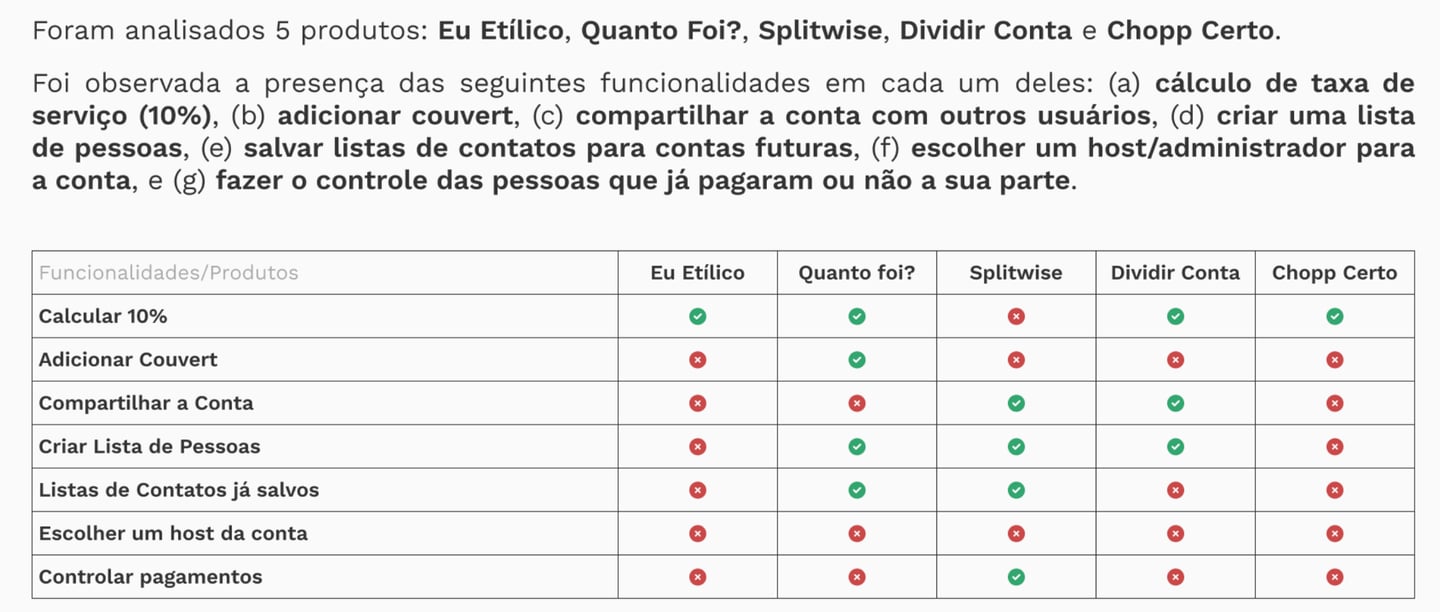
At the same time, we ran a benchmarking analysis of the main apps on the market: Splitwise, Eu Etílico, Quanto foi?, Dividir Conta, and Chopp Certo. We evaluated usability, features, and tone of voice. While many of them were functional and efficient, we noticed a common gap: a lack of empathy in their design. Most were overly technical, with little room for personalization and a neutral or even cold tone.
This analysis reinforced our unique value: delivering functionality with warmth.
With all this information in hand, we created a Value Proposition Canvas. In it, we connected what users truly cared about — clarity, ease, and lightness — with the unique value we wanted to offer:
Relief: removing the awkwardness of talking about money
Gain: offering control and transparency in a simple, beautiful way
Value creator: crafting a welcoming social experience, not just an impersonal calculator
This discovery process was essential for Sumbuddy to be born with purpose — not just as another finance app, but as a subtle mediator between friendship and responsibility. Every insight led us toward a more thoughtful, empathetic, and — above all — human path.
FROM PAPER TO PROTOTYPE: TURNING IDEAS INTO SOMETHING REAL
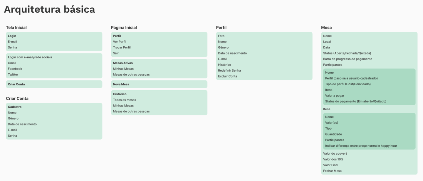
With users’ pains and needs clearly mapped out, it was time to turn empathy into structure. Before jumping into visuals, we needed to make sure the app made sense in how it was organized and connected on the inside — so we started with information architecture.
Our goal was to design an experience that felt natural: from creating a group to settling payments, everything needed to flow smoothly. We mapped the core features into logical, interconnected modules, making sure each action had a clear and intuitive path:
Home screen with an overview of groups and balances
Group screen with a list of expenses and members
Add expense screen with customizable split options
History screen to track what’s been paid and what hasn’t
Profile and personal settings area
Once the structure was defined, we moved on to user flows, which helped us visualize the full journey for different types of users. We created flows for key actions like:
Creating a group and inviting friends
Logging a new expense with proportional splits
Checking who has paid and who hasn’t
Marking a debt as settled
Receiving notifications about pending payments
These flows revealed opportunities to simplify clicks, reduce steps, and always keep the user in control. Instead of forcing new behaviors, we wanted the app to adapt to how people already think and act — not the other way around.
With that foundation in place, we sketched out low-fidelity wireframes to test the core paths before thinking about aesthetics. The focus was clear: functionality with flow.
This structural groundwork ensured that by the time we reached visual prototyping, we had a strong foundation. Every screen we designed was a direct reflection of everything we had heard, explored, and built — with purpose.
FROM IDEAS TO SCREENS: SHAPING THE IDEAL SOLUTION
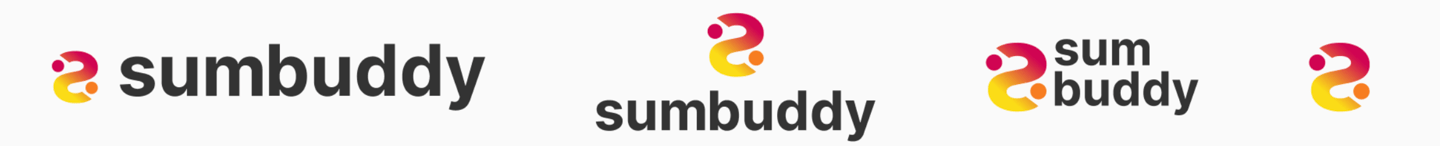
For the app name, we combined the idea of “Sum” (as in the math operation) with “Buddy” (as in friend). Sum represents the essential action of calculating shared bills, while Buddy reflects the social side — the friends we eat, drink, and hang out with.
We also wanted the app to feel like a helpful friend — someone who’s there to make bill-splitting easier and less awkward. That’s how we landed on the name: Sumbuddy.
The typeface chosen for the interface is Work Sans, a font designed specifically for screen use at medium sizes (14px – 48px). For iconography, we used the Font Awesome family, version 6 Pro.
Work Sans was used in both regular and bold weights, in normal and italic styles. The type scale for the interface was structured as follows:
XS (12 pt), S (14 pt), M (16 pt), L (20 pt), and XL (24 pt).
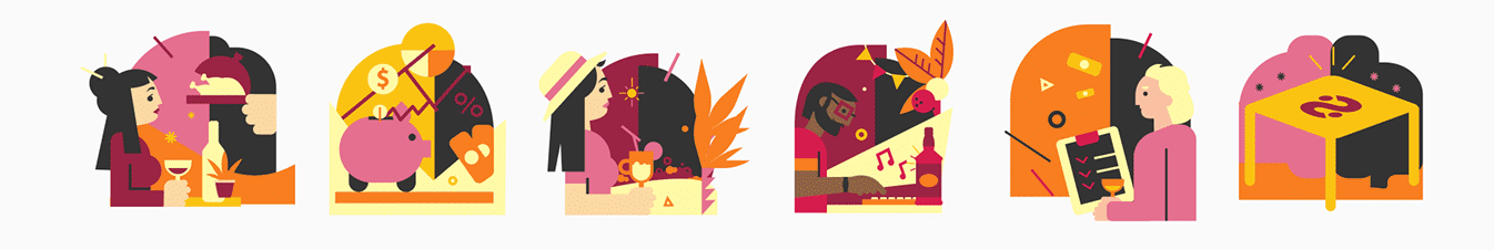
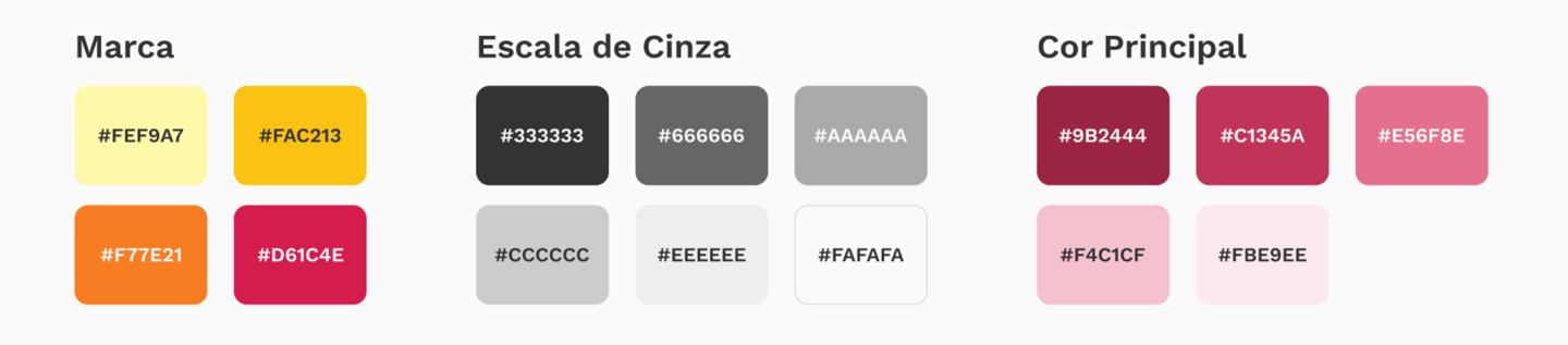
The brand’s color palette features warm tones to reflect the joyful and relaxed moments we hope to be part of. We also drew inspiration from the colors of drinks often shared in those moments — yellow for beer and wine red for, of course, wine.
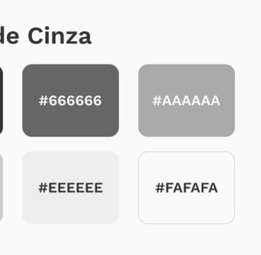
For the app itself, we worked with a comfortable grayscale as the foundation, carefully selected to be easy on the eyes. This grayscale also supported the app’s primary color — wine red — which stems from the brand’s identity. From that base, we built a versatile palette of reddish tones, ensuring enough contrast for clear and accessible information display.
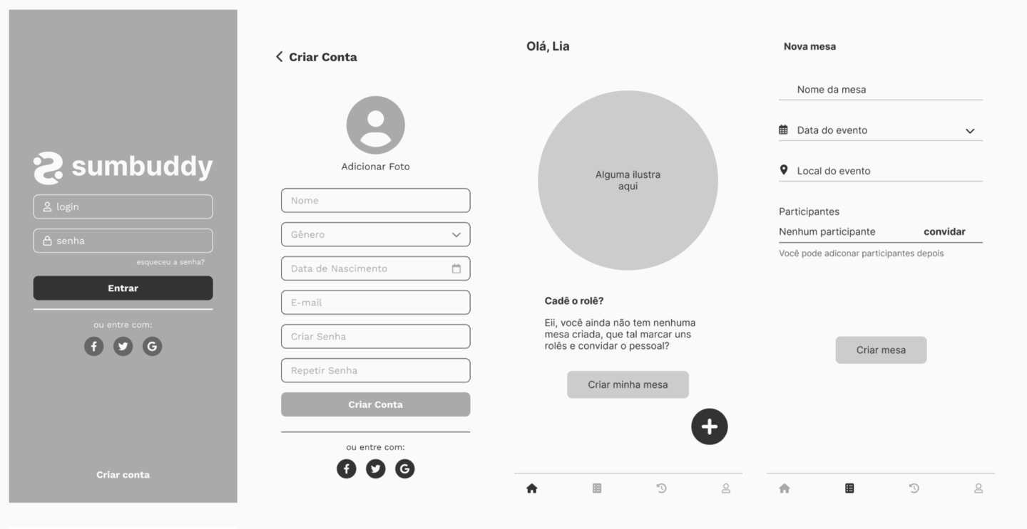
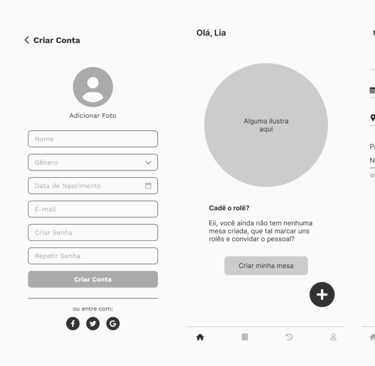
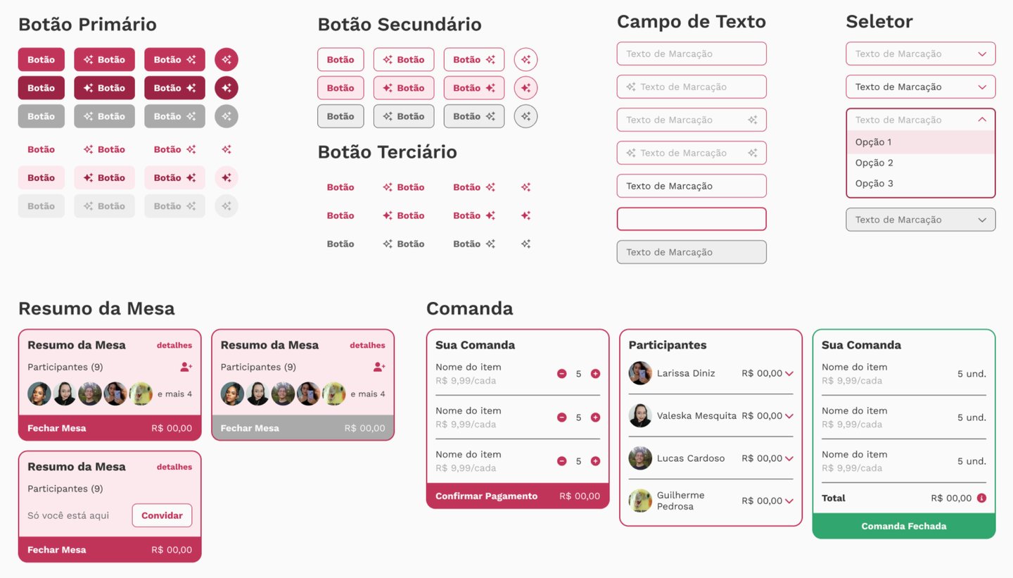
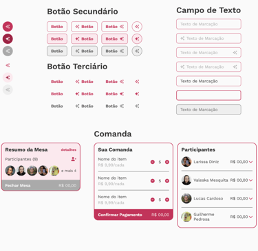
WIREFRAMES
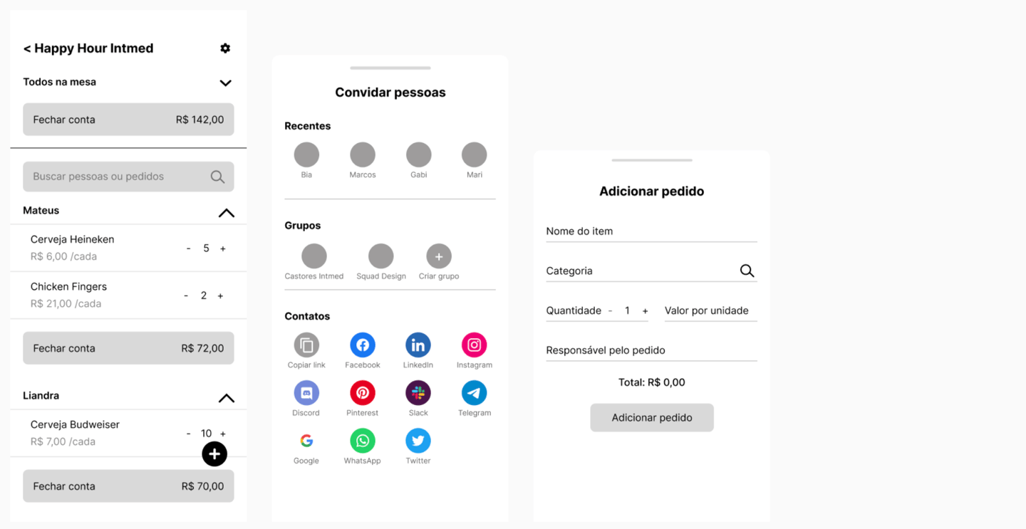
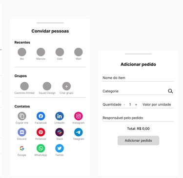
UI COMPONENTS
📎 Click here to be redirected to the interactive Figma prototype