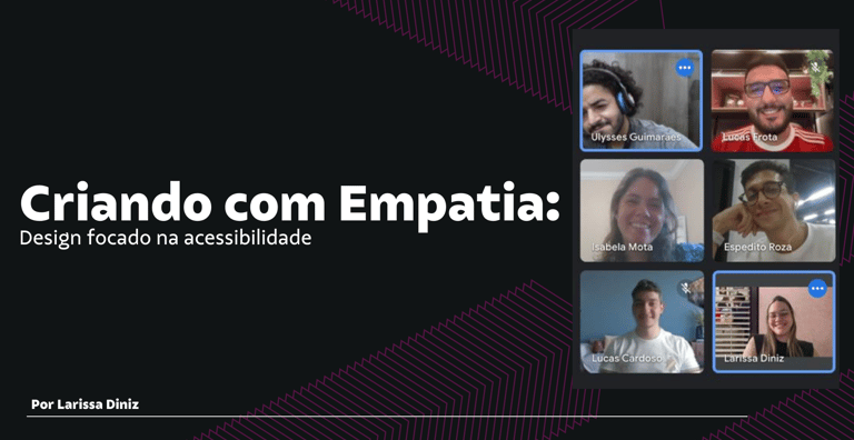
Designing with Empathy: Leading a Workshop on Digital Accessibility
A few months ago, I found myself thinking deeply about something that kept bothering me.
We, as designers, talk a lot about user-centered design. We build flows, run usability tests, talk to users. But still — something essential often goes unnoticed: accessibility.
That realization came up subtly, during conversations, design reviews, or when we rushed to ship features. It wasn’t that people didn’t care — it’s that many simply didn’t know how to care. So I decided to do something about it.
Planting the seed
I proposed a talk for our design team. Nothing too formal — just a space to reflect and learn together. I wanted to bring accessibility to the table in a way that felt real, applicable, and grounded in empathy.
The title? “Designing with Empathy.”
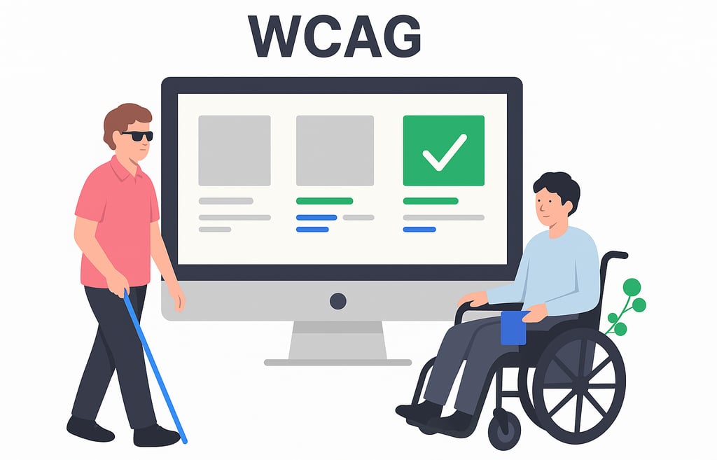
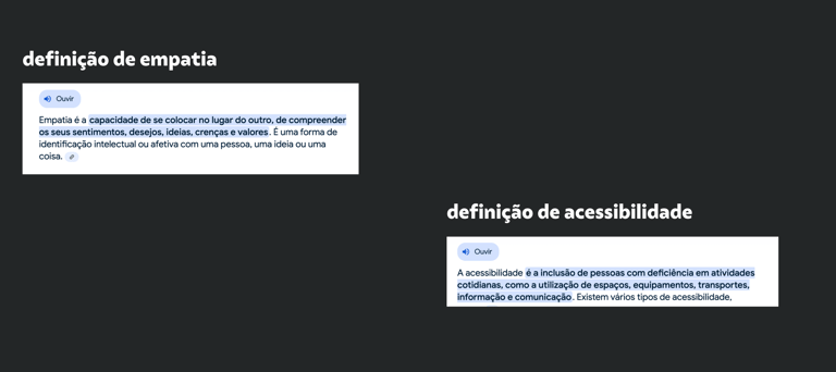
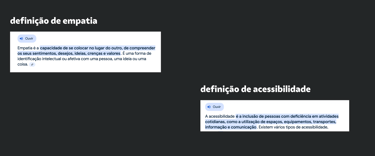
I started from the beginning. We talked about how accessible design starts not with rules, but with people. People with diverse abilities, ways of navigating the world, using screen readers, keyboards, color filters — and most of all, people who often get excluded from experiences we build.
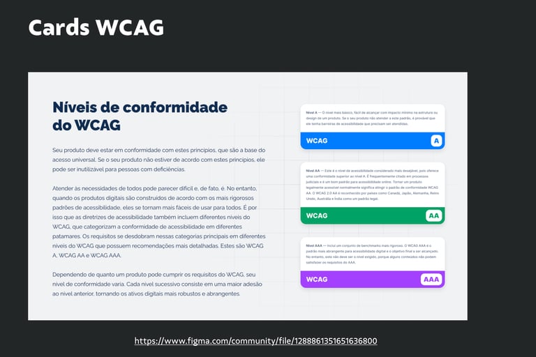
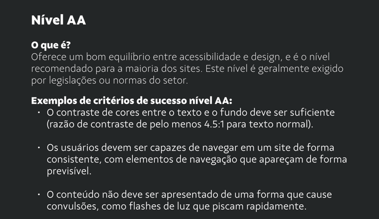
We explored the WCAG principles — Perceivable, Operable, Understandable, Robust — and what those really mean in everyday design. We broke down the levels of compliance and the idea that accessibility isn’t all-or-nothing. It’s a process. A commitment.
These insights were critical. They didn’t just validate our mission — they shaped our solutions.
Turning empathy into action
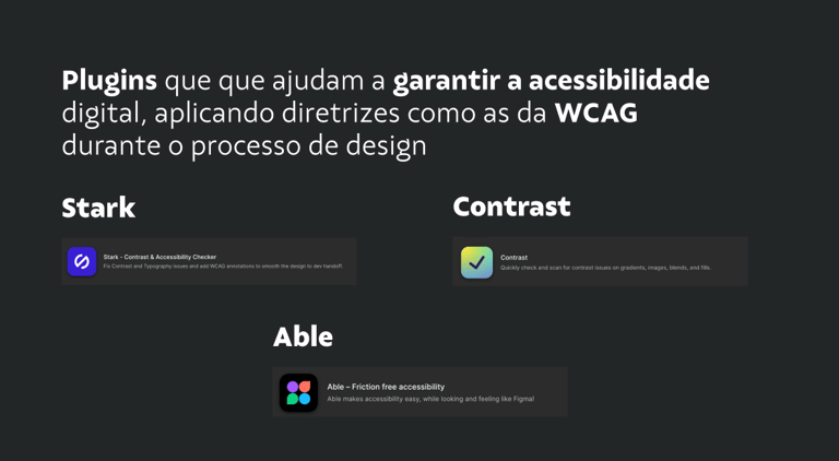
But theory alone doesn’t change habits. So I brought the team into Figma and introduced a few accessibility plugins — Able, Stark, Contrast, among others. We tested real designs, checking for color contrast, keyboard focus, alt texts, and visual hierarchy.
It was simple, quick, and eye-opening.
Some designers noticed contrast issues they had never seen before. Others realized how many components didn’t support keyboard navigation. For many, it was the first time analyzing an interface through the lens of someone who interacts with the web differently.
A quiet shift
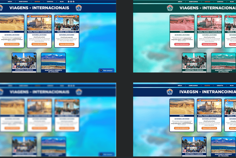
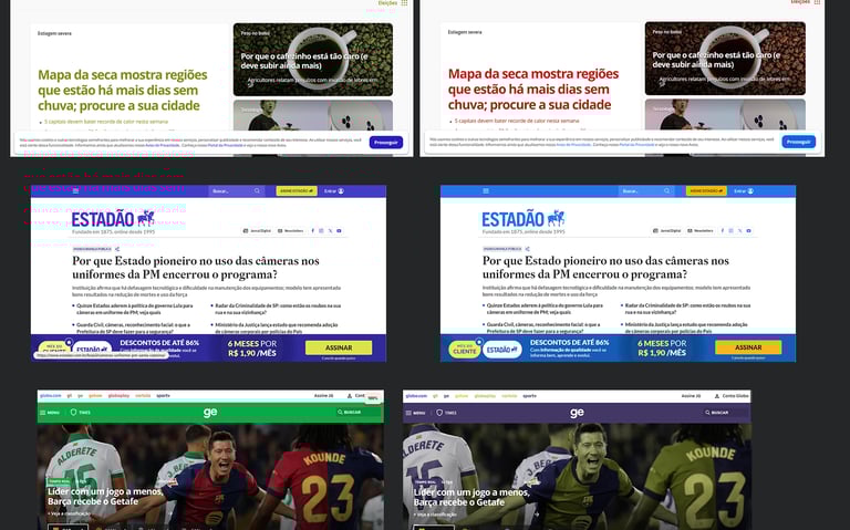
To close the workshop in a hands-on and lighthearted way, I created an activity called the "Accessibility Treasure Hunt." The idea was simple: each designer had 20 minutes to explore a real website and identify accessibility strengths or barriers using the plugins I had introduced.
I suggested a few categories for them to choose from — fashion or e-commerce sites, news portals, restaurant websites, travel agency platforms, and online education tools. The goal was to let each person explore something relevant to their interests, while also revealing common (or unexpected) accessibility patterns across the web.
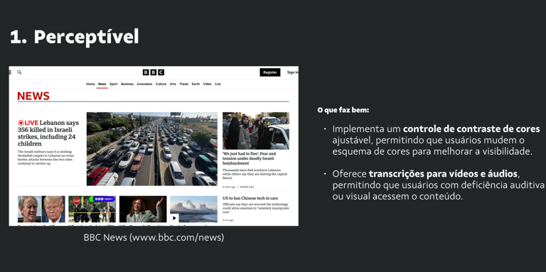
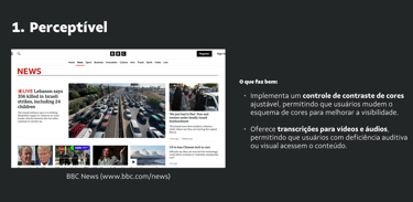
During the activity, the energy was one of curiosity and discovery. Designers were surprised by poor contrast ratios on big-brand websites, menus that didn’t support keyboard navigation, or carousels that were completely invisible to screen readers. On the other hand, they also found unexpected good practices: well-written alt texts, visible focus indicators, clear semantic structures.
At the end, everyone shared their findings informally. What started as a technical task quickly became a moment of real exchange — where each person realized how accessibility can, and should, be a lens through which we approach our work as designers.
And that’s when I noticed something had shifted.
Subtly, almost silently, accessibility was no longer a distant concept — it had started to live in the team’s everyday mindset.
Looking Back
This experience reminded me why I love design — not just for pixels or prototypes, but for the possibility to create fairer, more human experiences.
I realized that often what’s missing isn’t the will to do better, but safe spaces to learn and share. Through the workshop, I didn’t want to be the keeper of knowledge — I wanted to open a door. To show that accessibility is within our reach, even in the smallest details: choosing colors with proper contrast, writing thoughtful alt texts, creating buttons accessible by keyboard.
I also understood that culture change takes time — and that’s okay. Sometimes, change starts with a conversation, a plugin installed, or a question raised. Other times, it begins with a story that resonates or an example that inspires.
The most important thing is to take the first step. And there, with that group of designers, I took mine.
Since then, I’ve been committed to keeping this spark alive — bringing accessibility into discussions, including it as a criterion in deliverables, studying, listening — and most importantly, realizing that accessibility isn’t a checklist, but an ongoing commitment to others.
This was a small gesture within one company. But I believe real change begins like this: in everyday moments, with empathy, intention, and practice.